Right after I've finished my ancillary products I have asked some of my class mates to review my design. The reactions are written and linked here on a post that I wrote earlier.
To get a point of view of a wider audience I asked some of my friends to review my ancillary products through a social networking site; Facebook:


I was pleased with the reaction that our video got during the cinema screening. I could hear that everyone enjoyed the video. Whether it was the location, singer or the lyrics on the screen; people were enjoying the screening.
I have done all this to get a clear idea of how my product was seen from the point of view of my customers.
Our music video theme and the reason why it appeals to the target audience is not random. We have made a profile for our target audience in our pitch. Here is the screen shot from our prezi:
 I think that my music video and the ancillary products work well with the target audience that we considered in our pitch. This is also why our reviews are very positive and appealing to the audience.
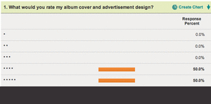
There weren't many negative comments about my design but I will go over some things that I would change.
I have done all this to get a clear idea of how my product was seen from the point of view of my customers.
Our music video theme and the reason why it appeals to the target audience is not random. We have made a profile for our target audience in our pitch. Here is the screen shot from our prezi:

There weren't many negative comments about my design but I will go over some things that I would change.
Font
Many people like the consistency of using just one font; Gill Sans Light. I also only used two colours and two "shadows of red and blue". This made the album look professional.
However I got a few comments that the track list has a colour that is difficult to read because it blends in. I used white font on a light brown background which could explain the blending in. I have also received a comment that the font uses inconsistent capitalisation which I agree with. The track list uses capital letters only for the beginning of the track name and not for every letter or even every word.
I have used capital letters all through out the digipak except for the track list which might look odd.
Advertisement
I got a suggestion that the CD cover or the background in my advertisement should use more intense colours to stand out more. I think this is a valid advice but it won't really add anything better to my design. I have used a colour that is quickly associated with the album and i think it works great. I have used a shadow and my QR code is on top of the album which creates layers. I think this makes the digipak stand out on the similar background of my ad.
Front Picture
"I think the photo on the front would have looked better if there was a bit less opacity"
This is one think that I did actually try out before finishing my digipak. I have used lower opacity to check how the image looks and whether it makes the image blend in nicely. As I did so, the image became less and less recognisable because it was blending in with the background too much. Because the patterns and colour are similar on the image and the background the blend in nicely the way they are know.
Inside
I got mixed reviews of the design. Some say that it's too empty, some that it is simple and it works. I have decided to use just a few images and no text. Also the CD only has the artists name ,the album title and the "Brighton doughnut" outlines. I think this simplistic approach makes the CD more professional and appealing to my audience.