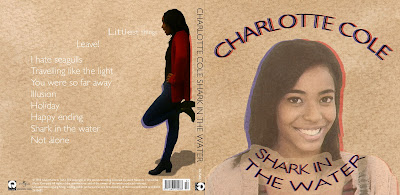
Front Cover
Good:- Background (colour and texture)
- Image Effects
- Red and blue shadows
- Worn out look
Bad:
- Image blends in with the background
- Inconsistent capitalisation with the title and the track list
Inside
Good:- Clear link
- Simple and professional
- Colour scheme
- The CD "doughnut lines" look like whiskers
Bad:
- Empty/lack of text
Advertisement
Good:- Clear Link
- CD stands out
- Good reviews
- Great idea with the QR code (maybe get rid of the white inside the code)
- Simple
I'm very happy with the result. After I got the feedback I have changed one thing which is using capital letters for the track list to let the album design flow better. Previously I have used small letters throughout the track list and capital letters everywhere else.
I didn't want to get rid of the white background of the QR code because I think it would decrease reliability of that code when it's printed on a low quality newspaper.


