After experimenting with the effects on Photoshop and Photoshop Elements, I wasn't satisfied. I've decided to make my own backgrounds, scan them in and use them in my design. I bought some watercolour paper because it's thick and it's easier to create different shades and effects on it. I used a transparent, brown ink and scanned the papers. Here is a slide show of the scans(four scans of seven pieces of paper including blank papers to manipulate on Photoshop):
Wednesday 21 December 2011
Sunday 18 December 2011
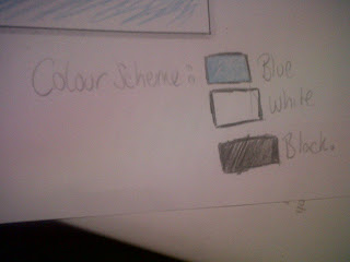
I've started to work on my digipak something which at first I was still finding a little difficult as I'm still not used to using Photoshop and some of my initial ideas that i had put in my mock up don't look as impressive in reality. so far I've stuck to my colour scheme of blue , white and black and below are a few screen shots of my digipak !


Thursday 15 December 2011
Planning: ideas for ancillary
Coming up with ideas for ancillary were tough as the design must sell our artist, relate to the artist and relate to our music video. I find the genre of indie pop much harder to produce ideas than pop since indie pop designs usually require neutral colours compared to the bright colours used in pop genres. During my research on other albums and digipaks, I found that majority of them used a large image of the artist on the front cover with a simple back panel in a colour matching the front. This is the design I am aiming for as it is simple but effective. Due to the fact our artist is serious about her music, I want the digipak to reveal this through the design to show that she is all about the unique voice. Additionally, the font will also be fairly simple. At first, I wanted the image with 'CCx' imprinted on the sand for the CD housing but later decided to use the image on the opposite inner panel behind written details for each song.
Colour scheme: tan/brown & white for text
Tracks: same tracks from VV Brown's album
Artist name: Charlotte Cole
Digipak name: L.O.V.E
Font: Gill Sans MT (bold for artist name)
Number of panels: 4
*Pictures to be added*
Colour scheme: tan/brown & white for text
Tracks: same tracks from VV Brown's album
Artist name: Charlotte Cole
Digipak name: L.O.V.E
Font: Gill Sans MT (bold for artist name)
Number of panels: 4
*Pictures to be added*
Wednesday 14 December 2011
Production - 1st day
This is what I've done so far. By Thursday, the front and back cover will be finished so that I will be able to make a start on the inside panels of my digipak.

Planning - Changes to my original idea...
In our last media lesson, I have started the production of my digipak on Photoshop. However, after placing the images, I've realised that the images I've chosen originally don't quite work together.

Therefore, I've decided to keep the photo of her in the shell, but to extend it to the back cover of the digipak...

Therefore, I've decided to keep the photo of her in the shell, but to extend it to the back cover of the digipak...
This looks a lot better to me than my original idea, therefore I've decided to carry on with this.
Planning - Shark In The Water font!
I was looking through the fonts on Da Font's website, and I've come accross this interesting font...

The font has the same name as the song we've chosen! It must be a sign...
Joke aside, I actually like this font. It's easy to read. I am therefore considering to use this font in my digipak.

The font has the same name as the song we've chosen! It must be a sign...
Joke aside, I actually like this font. It's easy to read. I am therefore considering to use this font in my digipak.


Planning - Short list of photos
These are a selection of the pictures I'd like to use in my ancillary products.
Planning - Short List of Fonts, colours, layout and design ideas + link to ancillary products
This is my short list of fonts:


I wanted simple font that looks professional, which would reflect the fact that our artist, Charlotte Cole, is a serious singer.
Gill Sans and Candara caught my eyes but my favourite one is Gill Sans (Light). I was thinking of using the same font, but Regular, for the name of the artist in order to put a bit more emphasis on her name.

To help me decide on a colour scheme, I've used the Color Scheme designer (which is available on the internet).
Because most of the pictures we have of our artist were taken at the sea side, I've decided not to follow my group's decision about the colour scheme as I think it would be better to continue that "sea side feel" our pictures have throughout my digipak (My advertisement will also follow the scheme, in order to make a direct reference to the album cover). So, I was looking for colours that would match a light blue / sky blue colour...
I will therefore use the following colours: Blue, brown/gold, orange.


I really like the layout of this digipak. It's simple and beautifully designed. This album (The Listening) is her first album. They are trying to introduce her to the public, which is what we are trying to do at the moment.
I'd like use two elements of her digipak in mine: The simple layout and the emphasised image of the artist, as I think this the right way to get people to discover Charlotte Cole and to reflect the fact that she is a serious song writer.
For the advertisement, however, I've decided to follow what Ellie Goulding has done. A picture of the artist on the right and the information on the left side with a direct reference to the album cover.
I am also planning on placing a QR code on my advert, as an innovative and "fun" way for people to access our artist's website.
Monday 12 December 2011
PRODUCTION: First day of production
Today I started creating my digipak design on Photoshop Elements. I was experimenting with different textures and effects. I also had a go at creating the effect of ripped paper. Here is what I came up with for the front and back cover: There are still some part missing such as artist info and copyright and spine information. I might also reconsider some of the effects that I have used.


Planning: do's and don'ts of design
Do:
Don't:
- Use clear readable font, preferably not fancy
- Use appropriate sizes for images and font
- Use clear photos that are in focus, no screen shots from video
- Use photos that are an appropriate shape for the page
- Use a layout that follows the rule of thirds
- Use an appropriate type face that follows genre conventions and house style
- Be careful where you place the font, it must follow conventions and clear from a distance
- Follow the conventions of the three colour rule and uses colour that is appropriate for images, font and background
- Think carefully about how you use and integrate font, image, text and language; specific placement embeds meanings
- Use appropriate industry logos and conventions making sure they're properly positioned

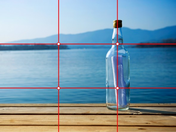 |
| Rule of thirds |
- Stretch images, this will make them out of focus and pixelated
- Use layer styles
- Use necessary effects that suit the genre
- Place text across the artist's face
- Use a font simply because it suits your liking
- Use a separate photo on every panel, be creative
 |
| Pixelated image |
Planning: mock-up of advertisement

My mock-up is clearly uncompleted due to the large blank spaces. This is because I struggled to come up with ideas for my advertisement. At the moment, I am focusing on my digipak then my advertisement ideas will become clear. Other than the essential items needed (i.e. image of digipak, release date etc.), the only ideas that I am sure of are the font and the critics reviews.
PLANNING: Additional Photos
On todays lesson we started to do our digipak in Adobe Photoshop Elements however we realised that we don't have enough images of the artist, close ups and mid-shots in particular. We have decided to take some more pictures in the room with the green screen so it's easier to edit. The lighting in that room is also much better. We will take the pictures during lunchtime and then add them to this post.
Below, are a few pictures that Max took during the "photo shoot"...


Sunday 11 December 2011
PLANNING: Inspiration
My first design was not inspired by anything which is probably why I rejected it quickly.

My second design is inspired by Kate Nash and her album "My Best Friend Is You".

I like the off white colour and photomontage used. I would like to create an old, used, worn out look which I think is good for the genre of the artist. I'm also considering using some song titles from her album that would match my album such as "I Hate Seagulls"
PLANNING: Mock up of my advertisement

PLANNING: Mock up of my digipak
The above is a slideshow of my ideas for a digipak and the advertisement.


Finally I will use the image of "Brighton Doughnut" because its unique and works well as a CD design.
RESEARCH: Previous student work - Advertisement
Here are three advertisement made by previous students. I will analyse them by pointing out what I think are their strengths and weaknesses.
 I really like this image, its very powerful and introduces the artist very well. I like the colour scheme; this sepia, old look works well with the genre. The image used links to the album and therefore does it's job of advertising it. The font is big and easy to read but the name of the artist should be bigger. I personally wouldn't use two different font but I think it looks ok with this advert. Album rankings/reviews or tour dates would improve the look of the advertisement. Without it, it seems like there is something missing.
 This is another advertisement that I like. It's simplistic but not simple. It shows off the album design very well, it's clear that this is an album poster because of the ratings, "OUT NOW" and places where you can buy it from. However I wouldn't use OUT NOW in my advertisement because I think it's important to advertise a product before the release and not after.
I don't like how there is a white background in the logos of iTunes, HMV and Amazon which unfortunately is where the eye immediately goes.
PLANNING: Do's and Don'ts
DO:
- Use clear font and images in appropriate sizes
- Use the Rule of Thirds
- Use the three colour rule and use it appropriately with images font and background
- Think carefully when placing font, text/language and images
- Use appropriate industry logos and conventions, properly positioned (barcode, copyright etc)
DON'T:
- Stretch images
- Use unnecessary effects
- Place the text across artist's face
- Use a separate photo for every panel
Research: ancillary ideas
Above are photos of I have taken of albums and digipaks that I have at home. I was specifically looking for inspiration for my own digipak. Since planning my ancillary ideas, I have had vague ideas of the back panel and inside panel. I want to create a list of song details on the inside panel inside of just a photo alone. My teacher Tony liked the idea as it is conventional but I was the only person who wanted to create this in the class. I first got this idea from the booklet of my Lady Gaga: The Fame album. I am always curious about the writers and producers when it comes to songs that I like. I feel that artists who have a part in both those areas are more likely to have this song details within their album i.e. Lady Gaga, Dannii Minogue (shown above). Our artist Charlotte Cole, is a serious singer songwriter who is all about the voice rather than the image, therefore having descriptions/details of each song in my digipak will not only let her fans know more about her but also show that she is serious about her music.
From the photos, Justin Timberlake and Britney Spears' album are digipaks. Justin's consists of four panels whereas Britney's consists of six. Both have very different designs as both are of different genres. Justin's digipak is a simple design as it only contains four tracks of the same song: one is the original track, the three others are remixes. Britney goes for a more eye catching metallic design as her digipak is of all her greatest hits and therefore consisting of more information, pictures and bonus features for fans who buy it will feel closer to the artist, act as a collectable. I took pictures of the inside panels from both purely because I like the designs.
Most of the photos I took were of the back panels and song details within the album booklet. The majority of those I took consisted of a main picture of the artist(s) on the cover and a simple, plain design (one colour background related to the front and track listing) for the back panel. This is the design I am aiming for on my digipak. The only difference is that I will have my song details on the inside panel adjacent to the CD housing instead of a booket.
The other photos I have taken were chosen because I felt that they suited to the artist and genre. I may not use all the design ideas for my own but may use or adapt certain, specific ideas e.g. the graphics, the way the pictures are taken, formation of the back panel etc.
Finally, the photos I have used are of (in order of appearance):
- Justin Timberlake: Sexyback - inside panel
- Lady Gaga: The Fame - back panel and song details from booklet
- The Wanted album - back panel and photos from booklet
- Girls Aloud: Tangled Up - back panel and credits from booklet
- Rihanna: Good Girl Gone Bad - song details from booklet
- Britney Spears Greatest Hits: My Perogative - pictures from inside panel
- Madonna: Celebration - front and back panel
- Dannii Minogue: The Hits & Beyond - back panel and song details from booklet
Saturday 10 December 2011
Mock up of Digipak and Advertisement
I pitched this idea to my media teacher (Tony) and the rest of the class .I decided to to my mock up of my digipak and advertisement the old fashioned way ! above are some images of a rough idea of what my end products may look like .
Colour scheme and fonts
I found a program on on the mac's that had a wide range of fonts some of which i thought would work well for my digipak and advertisement
Potential Fonts :


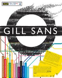 Another font that i have been thinking about using Gill Sans Light the font used for TFL
and the font used our music video
Potential Fonts :


and the font used our music video
Potential photo's for digpak and advertisement
i have decided to make a four panel digipak and these are some of the potential images i intend to use for my digipak as well as my advertisement.my main reasons for selecting these images are that i think they would represent the artist (Charlotte Cole) in a positive manner .
I have also come up with a potential colour scheme for my advertisment and digipak which is a mixture of three colours Blue white and black
Examining Previous Ancillary Work
As a class we looked at and examined previous student's work which included digipaks and advertisement and these were some of my findings !
The Martiniques :

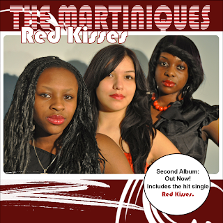
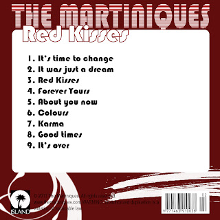
I found that some of the strengths of the ancillary work were things such as : A constant use of the same font , The artists name is in the largest size font , The advert has the record label logo , the main image has all band members making direct eye contact to the audience . The colours used are eye catching and it is easy to see the colour scheme. A weakness of the ancillary work is that there appears to be a spelling mistake
Stephnie Jackson :


Some strengths of this ancillary work is that the images used look a high standard , the sepia colour of the images is used constantly throughout . however some weaknesses were that the title of the album was spelt wrong . in the digipak it appears that the images are of three different people which is confusing as it's not quite clear who Stephanie Jackson is .
Y.Shocker
: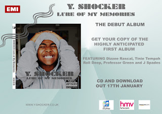
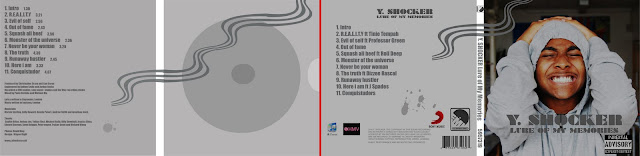
Some Strengths : The constant colour theme , the graphic "wave" is eye catching Weaknesses : The digipak has two conglomerate logos stating that the artist is signed to both which is very unconventional . Also having the hmv and iTunes logo on the digipak is something that is never included . Something that i disagreed with one of my teachers on is the back ground of the image of the artist, it's not clear where the artist's location and it looks as if he is standing in a corridor which i thought went with the genre ( I assumed it was grime ) as it gave a very "urban " and street feel .
The Martiniques :
I found that some of the strengths of the ancillary work were things such as : A constant use of the same font , The artists name is in the largest size font , The advert has the record label logo , the main image has all band members making direct eye contact to the audience . The colours used are eye catching and it is easy to see the colour scheme. A weakness of the ancillary work is that there appears to be a spelling mistake
Stephnie Jackson :
Some strengths of this ancillary work is that the images used look a high standard , the sepia colour of the images is used constantly throughout . however some weaknesses were that the title of the album was spelt wrong . in the digipak it appears that the images are of three different people which is confusing as it's not quite clear who Stephanie Jackson is .
Y.Shocker
:
Some Strengths : The constant colour theme , the graphic "wave" is eye catching Weaknesses : The digipak has two conglomerate logos stating that the artist is signed to both which is very unconventional . Also having the hmv and iTunes logo on the digipak is something that is never included . Something that i disagreed with one of my teachers on is the back ground of the image of the artist, it's not clear where the artist's location and it looks as if he is standing in a corridor which i thought went with the genre ( I assumed it was grime ) as it gave a very "urban " and street feel .
Subscribe to:
Posts (Atom)