Sunday 29 January 2012
FIN
This is the end. No more blogs about our inspiring research, creative and detailed planning and exhausting and long production :) This has been a fantastic journey and I really enjoyed all the time I spent filming, editing and blogging after hours. It would not be possible without my fantastic group members(Max, Natalie and Danielle) as well as my extraordinary teachers; Tony and Rebecca :) I hope my blog will be a joy to read. Goodbye
The End
This is my last blog post... It has now been two years that we've been using Blogger. We've had some good and bad times with it and I'm sure that our media teachers will agree. I've now finished my music video & my ancillary work, therefore I won't be posting here anymore. I hope you guys enjoyed it as much as I did.
Goodbye.
EVALUATION - Question 3
How did you use media technologies in the construction and research, planning and evaluation stages?
YouTube has played a significant role in my research and planning throughout the course. It was very useful as I was able to search for existing music videos in order to look at the conventions of the different genres but also to get some inspiration for our music video. The different ideas I've had for our originated mainly from the videos I've seen from this website.
Dailymotion was another website I've used in order to watch existing media products as not everything is available on YouTube.
Furthermore, I've also used Vimeo. A website used by our college to upload our work. It has allowed me to look at previous students work and to evaluate them / get some more ideas.

Google Maps is another website which has helped me a lot during the research stage as it enabled me to look at the different locations we could use. Its Street View feature was also very useful, especially when it came to planning our shots we were planning to film Brighton. We couldn't go there before the filming, so this feature was very handy.


During the process of actually filming our video, we had the chance to use state-of-the-art equipments.

When we've finalised our idea, we had to present it to the class. To do so, we have used a Prezzi, which is an online presentation editor.

We were all already familiar with this camera as we have all used it to film our thrillers last year. It was very easy for me to get back to using this camera and it was actually a pleasure to use.

When we came back from Brighton, we have realised that we've taken a lot of pictures and that simply importing them onto a blog post wasn't suitable. We have found this service, which allowed us to make slide shows. It was a nicer way for us to show all the pictures that we've taken during that day!

As well as using a video camera, we have also used a still camera in order to record our progress during the filming but mainly to be able to take professional pictures of our performer to use in our digipak.


During the editing process, we have used Final Cut Pro. Again, we were all very familiar with this program although some people in my group have found it challenging to use.
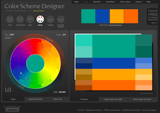
When we had to make our ancillary products, chosing the right picture was crucial. With a picture comes colour, and it may be sometimes difficult to pick the right colours for the elements that will feature on top of the photograph (Text, ...). Colour Designer allowed me to see which colours would go with the light blue of the sea shell.

In order to create my ancillary work, I had to carefully chose a font that would suit with the image of the artist I wanted to communicate. This website has allowed me to browse through thousands of fonts and to pick the right one, after narrowing my selection to a few.

When it was to the actual making of my ancillary products, I've used Photoshop. I was already familiar with this program as I've used it many times in the past. There are so many tools that this program features that have proven to be useful during this stage, but I think that the main one is the layers. The fact that this program layers everything you do (Text, images, shapes...) is really handy. I've also used its colour correction feature in order to enhance the colours of the photographs I've used.

As you are aware, my advertisement features a QR code. I've made this using this website, which features a QR code generator. You can specify the link where the code will take you and it automatically generates an image. Very useful!

Another generator I've used, is a gid generator. This is how I've created all the gifs that I've embedded on this blog. Once all the stills are ready (screenshots of a video, every second) you sent them to this website using the form and it automatically generates an animated gif for you.
Finally, Blogger played an important role in this task. Blogger is a powerful blogging editor which allows you to post whatever you want (text, videos, gifs, images, embedded html code...). This was used to share, with you, my progress throughout this task.
My last blog!
I can't believe my two years of blogging has now come to an end! I have enjoyed most of the challenges through my time in media which blogger has allowed me to share. I will be miss working with my reliable group members! I do wish more subjects would allow blogging rather than essay writing! Blogger, we have had some good (and bad) memories! Now I bid you adieu!!
Natalie x
Natalie x
Evaluation: Question 4 (part 2)
Here are the views of my fellow media peers & my teacher Rebecca:
Shannon:
Isla:
Ada:
Poppy:
Stephanie:
Evie:
My teacher Rebecca:
Overall, I am happy with the comments on our music video. All are very positive. I have learnt not to give up when completing a task, if you push yourself then you can produce something to be proud of! Thank you for all your positve comments!
Evaluation: Question 4 (part 1)
What have you learned from your audience feedback?
Audience reaction
During the screening of all our music videos, I recorded my group video while it played. As our video was the first to be played, I didn't get the beginning. This also includes the audience's reaction during and after it played. So here it is:
Audience feedback from fellow media students:
- Claire Elsby:
My ancillary: "I really like the colour scheme you used it really works well together and the simple font sticks to the conventions, you have followed all of them! The comments you made by various newspapers sounded realistic too & the photo on the back of the digipak linked completely to the video, the colours in the image also match the same kind of tones in the rest of the ancillary work which is nice. It is also the same outfit and artist as in the video, as well as having the pebbly beach photo on the inside which links back to your video clearly. The one thing I would say is it's a little plain and this plain-ness makes it slightly unattractive as a buyer, maybe if you used a larger font size for the album name and artist name on the front of the digipak it would have a little less peach coloured space, I really like the advert as well but it looks a little too square on to be real, but that's consistent throughout it so I doubt it will be a problem."
- Charlene Moore:
My ancillary: "I like the use of the name on the CD as it keeps the house style throughout all panels and the back panel shows personality with another image. The small use of colours works in your favour as it is not 'busy' but still effective; your layout on this panel is particularly effective. I really like the advert! The use of colours complements the genre. You have followed conventions with the HMV logos and reviews, the fact that it is simple keeps the focus on the purpose of the advert: to promote the artist. The CD front cover is a little simple, maybe you could have taken an image where the singer is in Brighton so it has a more interesting background."
Other comments from friends and family were similar. Many said that it was a little too plain but it matched the genre of the song.
Evaluation: Question 3
Click here to view our animatic that we produced by taking pictures of a miniature model in front images from Google Maps, which we then edited on Final Cut Pro. Enjoy!
Evaluation: Question 2
How effective is the combination of your main product and ancillary texts?
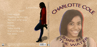
During filming, I made sure many pictures were taken during filming. This would allow us to have a selection of images to choose from that had a direct link to the video as the images were taken in the same location and our artist would be wearing the same outfit. At the beginning, I wanted an image of our artist on the beach on the cover. I had to change my original idea as most of those images were either not close enough or had no eye contact. Instead, I chose an image from the test shot. In this shot, our would be artist (as the shots were taken before we started filming) was wearing an outfit consisting of brown (similar to the music video outfit) which I felt matched our genre and my colour scheme.
The image I chose for my back panel is from the filming photos. I wanted a clearer shot of her whole outfit to be placed next to my track listing which also matched my background colour.


During filming, I made sure many pictures were taken during filming. This would allow us to have a selection of images to choose from that had a direct link to the video as the images were taken in the same location and our artist would be wearing the same outfit. At the beginning, I wanted an image of our artist on the beach on the cover. I had to change my original idea as most of those images were either not close enough or had no eye contact. Instead, I chose an image from the test shot. In this shot, our would be artist (as the shots were taken before we started filming) was wearing an outfit consisting of brown (similar to the music video outfit) which I felt matched our genre and my colour scheme.
 |
| Test shot image | Filming image |
The image I chose for my back panel is from the filming photos. I wanted a clearer shot of her whole outfit to be placed next to my track listing which also matched my background colour.

For the inside panel, I chose the image with 'CC' imprinted on the sand to accompany my song descriptions. I like this image because it relates to the setting and artist without either of them being in the picture.
As for my advertisement, I chose a pebble like background image as I felt it related well to the beach setting. I felt that a picture with visible texture would be better than a plain one of the same colour as that would be too plain.
I think that through my ancillary work, I have shown that our artist is a serious songwriter that is all about the meaning in the voice and lyrics rather than about the image. Our music video doesn't consist of much heavy edits as we wanted to keep it simplistic. The same goes for my ancillary design's.
Due to the points that I have made, I think that the public will recognise the relations between both the ancillary and video straight away. I think that my ancillary along with the music video can sell because like I have mentioned before, our artist is all about the music. Therefore no matter how plain the design ism she would still sell simply because she produces good music thus attracts our target market. However, if I was to promote our artist with the ancillary alone or of a pop genre (occasionally more about image), it would not be successful as my design is too plain for the genre.
Friday 27 January 2012
The Last Blog Post
This years media coursework has finally come to an end ! i've enjoyed most aspects and the highlight would definitely have to the day spent filming with my lovely group !
i've been haunted by you for the past two years and now it's finally time to say farewell woohhooooooo!!
i've been haunted by you for the past two years and now it's finally time to say farewell woohhooooooo!!
Thursday 26 January 2012
EVALUATION: QuestionFour - What have you learned from your audience feedback?
The reaction of the target audience is the most important thing in making a product. It's them that we make it for so they have to be satisfied.
Right after I've finished my ancillary products I have asked some of my class mates to review my design. The reactions are written and linked here on a post that I wrote earlier.
To get a point of view of a wider audience I asked some of my friends to review my ancillary products through a social networking site; Facebook:

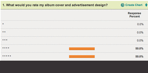
 I have also created a survey and posted it on the blog to get general opinion on my products. Here is the animation showing the results:
 On the day of the cinema screening I have recorded the reactions of some students and a media teacher; Mary. Here is the video showing their reactions:
Right after I've finished my ancillary products I have asked some of my class mates to review my design. The reactions are written and linked here on a post that I wrote earlier.
To get a point of view of a wider audience I asked some of my friends to review my ancillary products through a social networking site; Facebook:


I was pleased with the reaction that our video got during the cinema screening. I could hear that everyone enjoyed the video. Whether it was the location, singer or the lyrics on the screen; people were enjoying the screening.
I have done all this to get a clear idea of how my product was seen from the point of view of my customers.
Our music video theme and the reason why it appeals to the target audience is not random. We have made a profile for our target audience in our pitch. Here is the screen shot from our prezi:
 I think that my music video and the ancillary products work well with the target audience that we considered in our pitch. This is also why our reviews are very positive and appealing to the audience.
There weren't many negative comments about my design but I will go over some things that I would change.
I have done all this to get a clear idea of how my product was seen from the point of view of my customers.
Our music video theme and the reason why it appeals to the target audience is not random. We have made a profile for our target audience in our pitch. Here is the screen shot from our prezi:

There weren't many negative comments about my design but I will go over some things that I would change.
Font
Many people like the consistency of using just one font; Gill Sans Light. I also only used two colours and two "shadows of red and blue". This made the album look professional.
However I got a few comments that the track list has a colour that is difficult to read because it blends in. I used white font on a light brown background which could explain the blending in. I have also received a comment that the font uses inconsistent capitalisation which I agree with. The track list uses capital letters only for the beginning of the track name and not for every letter or even every word.
I have used capital letters all through out the digipak except for the track list which might look odd.
Advertisement
I got a suggestion that the CD cover or the background in my advertisement should use more intense colours to stand out more. I think this is a valid advice but it won't really add anything better to my design. I have used a colour that is quickly associated with the album and i think it works great. I have used a shadow and my QR code is on top of the album which creates layers. I think this makes the digipak stand out on the similar background of my ad.
Front Picture
"I think the photo on the front would have looked better if there was a bit less opacity"
This is one think that I did actually try out before finishing my digipak. I have used lower opacity to check how the image looks and whether it makes the image blend in nicely. As I did so, the image became less and less recognisable because it was blending in with the background too much. Because the patterns and colour are similar on the image and the background the blend in nicely the way they are know.
Inside
I got mixed reviews of the design. Some say that it's too empty, some that it is simple and it works. I have decided to use just a few images and no text. Also the CD only has the artists name ,the album title and the "Brighton doughnut" outlines. I think this simplistic approach makes the CD more professional and appealing to my audience.
Audience Feedback Questionnaire
Create your free online surveys with SurveyMonkey, the world's leading questionnaire tool.
Evaluation Q4: What have you learned from audience feedback ?
our music video got played at a cinema screening of the whole of A2 . The general reception from the audience was great ! a clip of the audience reacion made at the end of our video premier !
Some of the feed back from my completed ancillary work was also given comments below ;

From the feed back i have received on the music video and ancillary products was overall positive but comments of slight improvements were given about the music video specifically camera work when hand held use of the camera was used was an improvement this could have been avoided or improved by the use of tripod but the down side would have meant that there would be a lack of varied shots types .
All comments which were made are very important as they were either constructive criticisms or very complimentary. The comments were very useful as i was able to see potential improvements that i myself hadn’t recognised. From the feedback I am able to assume that my work was for the majority successful if the products were to be created again taking into account both the positive comments and criticisms the product wouldn’t differ much from the high standard produced .
Evaluation: Question 1 (part 2)
Influential music videos
After we were certain about our location, a carousel scene & some sort of text for our music video, I researched some videos on YouTube. While researching, I came across a carousel setting in 'Forgive Me' music video by 'Leona Lewis'. As we wanted to film on the carousel while it was moving, Leona Lewis' video completely relates to this. Moreover, this goes against typical conventions of music videos:
Below are clips from our music video with text:
The texts from below were influenced by the following videos that I also came across while researching. However, they required more advanced programs to produce the text so we opted for a simple format that was not only easier to achieve, but it suited our indie pop genre. The bold, bright coloured text used in Kanye West & Cher Lloyd's suited the upbeat tempo of their song. Although, I'd have liked to try to create that level of text, I am happy with the end result of ours. Finally, I think that the use of text in music videos has become more conventional in the past few years.
| Good Life by Kanye West |
| Hey, Soul Sister by Train |
| Every Teardrop Is a Waterfall by Coldplay |
| Swagger Jagger by Cher Lloyd |
EVALUATION: QuestionThree - How did you use media technologies in the construction and research, planning and evaluation stages?
Over the past months I have used a variety of tools and technologies to create my final products in the best quality. I have also used many technologies to broadcast and share my ideas, research and production.
Programs:
Final Cut Pro
Production:
Final Cut Pro was one of the most important tools that I have used. It let me edit, manipulate and put in place videos taken at the sea side to create the music video that everyone enjoyed so much.
I have used this program last year which made it this much easier and quicker to use this year.
I could easily cut and put separate videos in the right place. I was able to mark the video with the beat using "markers" (using the M key) which really helped with precise editing of the music video. I also used the markers to put all the base track and videos in synch with the original song.
Research:
In our final version of the video we didn't include any special effects done on this software but here is a video of me trying out some potential effects:
I was trying out a few effects(such us slow-motion and overlapping) that we could have used in our video to see whether they would fit into our genre and video. At the end we decided to only use lyrics on the screen. Using too many effects makes the video look unprofessional it also doesn't fit our genre.

Adobe After Effects CS5
Production:
I have used Adobe After Effects to create the lyrics on the screen. I used this software last year to create Candi Studios logo/animation so I knew some basics.
I prefer Adobe After Effects more than LifeType because it has much more possibilities and it is easier to time the lyrics more precisely.

Adobe Photoshop CS5
Production:
I have used this software for a few years now which allowed me to make my ancillary products much easier and faster. I have started by choosing my colour for the background and I used an Artistic Filter which created a nice paper pattern. Here I show how I apply a sponge effect on a different(to the colour I used in my design) coloured paper:
However real life images and textures can never look better when made digitally therefore I scanned pieces of watercolour paper painted brown and used them instead in one of the final stages of my production. At the end I have applied this effect only to my photos to blend in better with the background.
 A "grid" is a great thing to align, put desired images in the right place and in a good distance from each other. It is a simple tool that can make a big difference to the final product. It really helped with aligning the text, logos and images inside the digipak and on the advertisement.
To create the vintage, newspaper or as some called it the "3D" effect I simply duplicated the images and layered them on top of each other. I slightly shifted each of them to one direction and disabled one of their RGB colours to reveal either red or blue colour. Changing their opacity made them less strong and more like shadows; something additional and not the main focus.


iShowU and QuickTime Player
I have used iShowU and QuickTime Player to record the screen and show whatever program I was using and how I used them. It allowed me to easily express and explain how and why I did some effects.
MPEG Streamclip and QuickTime Player
 I used this software to export my videos in a lower quality that allowed me to post them on my blog. I used them to export my screen recordings as well as the interviews and the final edit of our video. The screen shot on the left shows MPEG Streamclip. To export them I had to drag my video clip to the center and select a preset that was compatible with blogger to get the best quality video which I was able to post.
Internet
Hardware
State of the art video cameras, memory cards, cameras, hard drives.
Blogger, Facebook, YouTube, Picasion, PhotoBucket
Hardware
State of the art video cameras, memory cards, cameras, hard drives.
All of this allowed us to film, plan and take potential pictures for the digipak. We have used the cameras to make an animatic which really helped with filming because we knew what and where to film and when to put it in the video. It shortened our editing and filming time which is one of the reason why the music video was a success. Here is the animatic that we made few months ago:
The video cameras allowed us to film the music video in a really hight quality and memory cards allowed us to instantaneously move that footage to our hard drives and edit.
EVALUATION - Question 4
What have you learned from your audience feedback?

On the 6th December, the media department has invited all media students to come along and watch everyone's production on the big screen at The Screen on the Green in Angel. It was a great opportunity for us to see how our the audience reacts to our video, to get individual feedbacks but also an incredible chance for us to watch what we've been working on on the big screen.
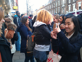
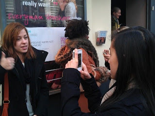
After the show, we've managed to film our audience reaction to our video and got some feedback from them. This was very interesting for us to see how our audience reacted to our video, if they liked it and to know what was good or what they think went wrong.
Below you will find five feedback videos which I'm going to talk about in more details afterwards...
The feedback we've had from everybody was very positive, which I think reflected the amount of planning and preparation we have done throughout this task. They've all stated that the location was one of our strengths, which has made our video look unique amongst the others. We were really glad to hear that, filming in Brighton was fun but was above all a lot of preparation. Nick then stated that the editing was on-time, which made it a genuine music video. This is really important that the editing follows the pace of the music, we have spent weeks to make sure that all our shots and the cuts were on beat. The text we've added and the choice of our performer was also something they've appreciated.
I think I may say that we've met our audience's expectations. We have made a great video and the fact that we've filmed it in Brighton contributed a lot to the success of it. At first, we were looking around London and on Google Maps to look for locations that'd match the lyrics of the song but we weren't completely satisfied with what we've found. We were then wondering if it'd be possible to film at the sea side. We have been warned by our media teachers that we should be carefull with this as it requires a lot of planning, which we weren't worried about because I think that as a group, our strengths was our planning skills and our reliability.

I think that the filming is something we can improve on. Despite having really good shots, a few of them look "experimental" to me and are very shaky. Since we didn't have a rail to put the camera on, it was very difficult to obtain a stable image while moving back...


The outer panels of your digipak are great. I love that you used one photo that spans across both panels. Overall it's simple but very effective. The only improvement I'd suggest is maybe have the album title stand out a bit more, although I understand that the focus is on th artist's name which is very eye catching. The inside panels are again simple, but maybe a bit too simple. It feels like it's missing something - possibly a less minimalistic CD design? Other than that, great!
I love your advert. It's pretty much perfect. The only thing that bugs me is that I feel like the text should have been placed a bit more to the left (and resized slightly if necessary), but other than that - awesome! The QR code is a nifty idea, and your use of asterisks instead of more conventional stars for the album reviews is cool and quirky.
Overall, your products link very well, and I must commend your choice of photo. Now where can I buy this album?
This is one of the many feedback I've had for my ancillary products. I've chosen to publish Nick's because I think it is the most elaborate one and covers what the other people have said.
Overall, my ancillary products work well together and the clear visual link with the video have made it successful. However, there are a few areas that can be improved. As suggested by Nick, the placement of the text in my advert is a bit too much on the right. This is something I haven't immediately picked up but that is now annoying me. A smaller size for "Out 1st February" and a different placement would have been beneficial, as I think it shouldn't reach the hole of the shell. But appart from that, I'm glad that the audience has appreciated the QR code idea.
Regarding the outer panels of my digipak, I'm glad that the picture met the audience's expectations as it was really difficult for me to choose one as they were all really good! However, there's something that I've noticed after submitting my work, and that Nick picked up, is that the title of the album doesn't stand out very much. I think a different colour would have worked better but at the same time I didn't want to use white as I thought it'd be overused.
Evaluation: Question 1 (part 1)
Above are pictures that I have taken of my own albums & digipaks which influenced my choice (mainly the Lady Gaga album) to add song descriptions to my digipak. This allows the fans to find out more about the new artist. Most albums include this in the information booklet. It is important to use a fair amount of close ups in the video and most importantly in the digipak cover. This along song descriptions and bonus content (on back panel) helps the public to familiarise with the new artist, involving the fans. The following pictures include (in order of appearance):
- My own digipak with song descriptions
- Lady Gaga: The Fame album
- Rihanna: Good Girl Gone Bad album
- Justin Timberlake: Sexyback single digipak
- Girls Aloud: Tangled Up album
- Dannii Minogue: The Hits & Beyond album
 |
| Adele: 21 album | My digipak |
Some of my advertisement ideas were influenced by Ellie Goulding's Lights album ad. I was sure that I wanted media reviews & a simple design. Ellie's ad consist of both of these. I feel that Ellie Goulding is quite similar to our artist Charlotte Cole due to the genre therefore that is why I used some aspects from her ad. I like the fact that there's a large image of the artist with her name written bold & clearly. I added all typical conventions on my ad such as website of artist, social networking sites, QR code, record label logo, release date etc. However, unlike Ellie's ad, I wanted a picture of my digipak on my ad.
 |
| Ellie Goulding: Lights advertisement | My advertisement |
Wednesday 25 January 2012
Q3 Evaluation : How did you use media technologies in the construction and research, planning and evaluation stages ?
Media technology was a tool that was used in all parts of the process of this piece of course work from the very beginning.
Below is an animatic created before our actual music video using a normal digital camera photo's were taken then imported into final cut pro, which was used in combination with another useful technology mac computers .
The internet enabled me to use even more media technologies such as :
Blogger which was vital in the planning process as it allowed me keep track of what was being completed planning if it were done manually it would have without a doubt have been lost but blogger kept an archive of work which is useful as i am able to go going back back all the way to the start of the course .
I used the program volia to create the clips of how i used these media technologies
Mpeg stream was what was used to convert the format of videos such as our animatic and our music video to enable it to be uploaded to the blog and vimeo
Photoshop was used to create my ancillary products being able to distort images and develop from my original mock up on paper to a digital format.
Youtube was used to help all stages research, planning and evaluation it was used as a tool to find the song used in the music video then it was tool to help research different music videos and allowed us to recognise the conventions which we are included in my music video. You tube also helped me to use another technology photoshop by watching online tutorials .
Final cut pro was one of the vital technology's used for the editing process which was a development from previous use as this time the use included using markers and keeping tracks in sync .Video Camera's were another technology of great use as it was what was used to film the music video, the cameras worked along side another technology used memory cards which enabled us to film a large amount of footage as they store a large volume of data.
Tuesday 24 January 2012
Audience Feedback - Ancillary Products
Here are some responses from my classmates and my teacher Tony about my album and advertisement design:


Front Cover
Good:- Background (colour and texture)
- Image Effects
- Red and blue shadows
- Worn out look
Bad:
- Image blends in with the background
- Inconsistent capitalisation with the title and the track list

Inside
Good:- Clear link
- Simple and professional
- Colour scheme
- The CD "doughnut lines" look like whiskers
Bad:
- Empty/lack of text

Advertisement
Good:- Clear Link
- CD stands out
- Good reviews
- Great idea with the QR code (maybe get rid of the white inside the code)
- Simple
I'm very happy with the result. After I got the feedback I have changed one thing which is using capital letters for the track list to let the album design flow better. Previously I have used small letters throughout the track list and capital letters everywhere else.
I didn't want to get rid of the white background of the QR code because I think it would decrease reliability of that code when it's printed on a low quality newspaper.
EVALUATION - Question 2


These are album covers from similar artists. They all convey the same message; the one of a serious, glamourous but individual song writter. This has inspired us to promote those different aspects in our video but also in our ancillary work.


We can clearly see that serious song writters (VV Brown, Adele...) use simple shots in their video to emphasis their personality. Cher lloyd's, however, is heavily edited which suggests that this is more mainstream.
Charlotte Cole is a new artist and a serious song writter. Therefore, we have decided to keep our shots simple and to stay away from heavy editing.

In conclusion, I think that the combination of our main product and my ancillary works work very well together.
Subscribe to:
Posts (Atom)