What have you learned from your audience feedback?

On the 6th December, the media department has invited all media students to come along and watch everyone's production on the big screen at The Screen on the Green in Angel. It was a great opportunity for us to see how our the audience reacts to our video, to get individual feedbacks but also an incredible chance for us to watch what we've been working on on the big screen.
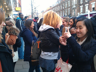
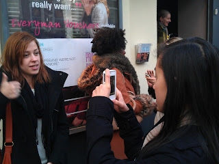
After the show, we've managed to film our audience reaction to our video and got some feedback from them. This was very interesting for us to see how our audience reacted to our video, if they liked it and to know what was good or what they think went wrong.
Below you will find five feedback videos which I'm going to talk about in more details afterwards...
The feedback we've had from everybody was very positive, which I think reflected the amount of planning and preparation we have done throughout this task. They've all stated that the location was one of our strengths, which has made our video look unique amongst the others. We were really glad to hear that, filming in Brighton was fun but was above all a lot of preparation. Nick then stated that the editing was on-time, which made it a genuine music video. This is really important that the editing follows the pace of the music, we have spent weeks to make sure that all our shots and the cuts were on beat. The text we've added and the choice of our performer was also something they've appreciated.
I think I may say that we've met our audience's expectations. We have made a great video and the fact that we've filmed it in Brighton contributed a lot to the success of it. At first, we were looking around London and on Google Maps to look for locations that'd match the lyrics of the song but we weren't completely satisfied with what we've found. We were then wondering if it'd be possible to film at the sea side. We have been warned by our media teachers that we should be carefull with this as it requires a lot of planning, which we weren't worried about because I think that as a group, our strengths was our planning skills and our reliability.

I think that the filming is something we can improve on. Despite having really good shots, a few of them look "experimental" to me and are very shaky. Since we didn't have a rail to put the camera on, it was very difficult to obtain a stable image while moving back...


The outer panels of your digipak are great. I love that you used one photo that spans across both panels. Overall it's simple but very effective. The only improvement I'd suggest is maybe have the album title stand out a bit more, although I understand that the focus is on th artist's name which is very eye catching. The inside panels are again simple, but maybe a bit too simple. It feels like it's missing something - possibly a less minimalistic CD design? Other than that, great!
I love your advert. It's pretty much perfect. The only thing that bugs me is that I feel like the text should have been placed a bit more to the left (and resized slightly if necessary), but other than that - awesome! The QR code is a nifty idea, and your use of asterisks instead of more conventional stars for the album reviews is cool and quirky.
Overall, your products link very well, and I must commend your choice of photo. Now where can I buy this album?
This is one of the many feedback I've had for my ancillary products. I've chosen to publish Nick's because I think it is the most elaborate one and covers what the other people have said.
Overall, my ancillary products work well together and the clear visual link with the video have made it successful. However, there are a few areas that can be improved. As suggested by Nick, the placement of the text in my advert is a bit too much on the right. This is something I haven't immediately picked up but that is now annoying me. A smaller size for "Out 1st February" and a different placement would have been beneficial, as I think it shouldn't reach the hole of the shell. But appart from that, I'm glad that the audience has appreciated the QR code idea.
Regarding the outer panels of my digipak, I'm glad that the picture met the audience's expectations as it was really difficult for me to choose one as they were all really good! However, there's something that I've noticed after submitting my work, and that Nick picked up, is that the title of the album doesn't stand out very much. I think a different colour would have worked better but at the same time I didn't want to use white as I thought it'd be overused.