Planning: do's and don'ts of design
Do:

- Use clear readable font, preferably not fancy
- Use appropriate sizes for images and font
- Use clear photos that are in focus, no screen shots from video
- Use photos that are an appropriate shape for the page
- Use a layout that follows the rule of thirds
- Use an appropriate type face that follows genre conventions and house style
- Be careful where you place the font, it must follow conventions and clear from a distance
- Follow the conventions of the three colour rule and uses colour that is appropriate for images, font and background
- Think carefully about how you use and integrate font, image, text and language; specific placement embeds meanings
- Use appropriate industry logos and conventions making sure they're properly positioned
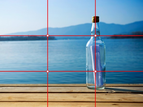 |
| Rule of thirds |
Don't:
- Stretch images, this will make them out of focus and pixelated
- Use layer styles
- Use necessary effects that suit the genre
- Place text across the artist's face
- Use a font simply because it suits your liking
- Use a separate photo on every panel, be creative
 |
| Pixelated image |
