The Martiniques :

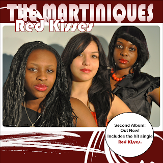
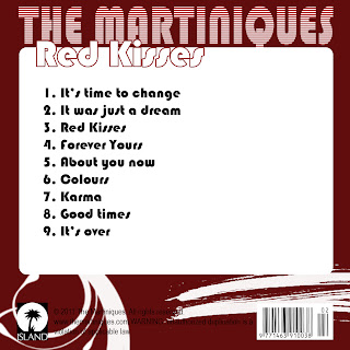
I found that some of the strengths of the ancillary work were things such as : A constant use of the same font , The artists name is in the largest size font , The advert has the record label logo , the main image has all band members making direct eye contact to the audience . The colours used are eye catching and it is easy to see the colour scheme. A weakness of the ancillary work is that there appears to be a spelling mistake
Stephnie Jackson :

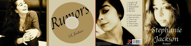
Some strengths of this ancillary work is that the images used look a high standard , the sepia colour of the images is used constantly throughout . however some weaknesses were that the title of the album was spelt wrong . in the digipak it appears that the images are of three different people which is confusing as it's not quite clear who Stephanie Jackson is .
Y.Shocker
:
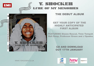
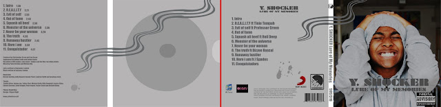
Some Strengths : The constant colour theme , the graphic "wave" is eye catching Weaknesses : The digipak has two conglomerate logos stating that the artist is signed to both which is very unconventional . Also having the hmv and iTunes logo on the digipak is something that is never included . Something that i disagreed with one of my teachers on is the back ground of the image of the artist, it's not clear where the artist's location and it looks as if he is standing in a corridor which i thought went with the genre ( I assumed it was grime ) as it gave a very "urban " and street feel .