Saturday, 10 December 2011

The Do's And Don'ts of Design Work

After our analysis of digipaks and doing some research on the conventions of ancillary products a few do's and don't were explained .
Dont's :
Do not use images print screened from music videos as they will appear pixelated
Do not stretch images 
Only use effects is they suit the genre 
Have a valid reason for using font not just because you like it
Do's :
Use  Clear font 
Use a layout that follows the rules of thirds of composition 
Use appropriate industry logos e.g : Record company logo's 
Use clear photo's that are in focus 
And most importantly BE CREATIVE !!!!! 

Thursday, 8 December 2011

 we were given the task of having ago at creating out own cd covers .. i'm not the most confident person when it comes to using photoshop so i was abit apprehensive but our teacher gave us a mini tutorial in using photoshop  to create and a new program we were introduced to  called quark express .


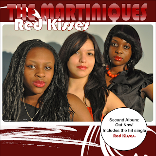
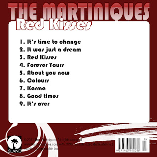
                                            The finished product ! :

Wednesday, 7 December 2011

RESEARCH: Colour Scheme, Font and Design Ideas

As I was thinking about the design of the album I was also thinking about the appropriate colours that I should use. I knew that I wanted to use warm colours such as brown, yellow, light red/orange. To see which three colours would go good together I went to google in search of colour schemes.
 I found a website; colorschemedesigner.com, which finds colours for you. So depending which colour you pick and whether you want the other colours to be mono, complement, triad, tetrad, analogic or accented analogically, the other colours will be chosen for you. Here are some examples of what I found:


From the beginning I knew what font I wanted to use. Its Gill Sans, a font used in our video and apparently also used by London Transport. I think using the same font as in the video links the album with the video nicely because its a subtle link. This font could also become a way of recognising the artist later on because it's quite simple and looks good in any occasion. I dont want to use font colours that are too drastically different from the colour scheme so I will probably hold on to black or white depending on the final design.

Monday, 5 December 2011

RESEARCH: Photobucket

Photobucket.com is a great website which allows easy sharing of photos in creative and space saving ways. It's easy to make a customised slideshow if you know how. I often caught myself wasting time on Photobucket, figuring out how to share my photos which is why I wanted to make this tutorial.

1. To create slidshows you need to make an account on Photobucket.com; it's free! After all that is done it's time to upload some pictures. Click on the "Upload" button...


2. It's best to make a sub-album, this way the images are more organised. To do that click on "Create new album" top, right(above the big green button):
3. Once that's done, lets add images by clicking:

 4. That was easy, now lets go back to our album by clicking:
 5. Click "Tools"...

...and "Try it now"
6. Here you can choose which images, when and how should they appear by following steps 1,2,3:

 7. Once the slideshow is saved (step 3), click on "Share"
 8. This will open a window where we have to choose "Get link code" and copy the "HTML fo Website & blogs". To do that, highlight the text by clicking and swiping your mouse button and selecting some of the text and then clicking CTRL + A to highlight all and CTRL + C to copy.

 9. "Edit HTML" and copy the link by clicking CTRL + V...

*10. This step is only for the "brave" ;-) To get rid of the two buttons at the bottom of the slideshow, highlight the text from "<a" to "</a>" as seen on the screen shot:

Here is the final effect:


RESEARCH: Similar designs and genres

Today I went to a local music store (HMV) in search of inspiration and artist names in the same genre as our artist. I have found many interesting album designs as well as artist names; here is a slideshow showing their designs.


Album artists in order of appearance:

Rebecca Ferguson
Bruno Mars 
Manic Street Preach
The Kooks
Sam Gray
Emma The Great
Buffalo Killers
Rumer
Ellie Goulding
Amy Macdonald
Lady Antebellum
Kelly Rowland

RESEARCH: Practice Digipak


We have been given some images, artist/album name and song titles. We were meant to design a test album cover. I used both Adobe Photoshop and Adobe Photoshop Elements.

I started by cutting around the image of the artist to use my own, custom background. I made the album look a bit futuristic and new because of the colours and font used but I think it works well. I used a grid in Adobe Photoshop to align all the text and images. Here is the final cover:

Sunday, 4 December 2011

Planning: analysis of three digipaks

Below I have analysised three album's of different artists within the same genre:


*more pictures to be added

Planning: analysis of three advertisements

Below I have analysised three advertisements of different artists within the same genre:


Although La Roux is not under the Indie pop genre, I chose to analyse this artist purely because I like the format & design as it fits perfectly with the artist image and electropop genre.

Research - Analysis of three advertisements from previous students


Strengths
    • Uses the same layout used in the album
    • Has the front cover
    • Website address
    Weaknesses

    • The white background makes it a bit too "simplistic"
    • The iTunes logo is smaller than the HMV logo; they should be the same sizes.
    • No the same record label (on the Digipak, it says Sony. Here, we have Island Records)
    • They don't look very happy.


    Strengths
    • Colour scheme
    • Photograph
    • It has the front cover of the digipak
    Weaknesses

    • Her face is badly cut
    • Different fonts are used
    • No record label


    Strengths
    • Clear presence of the front cover of his record
    • Website address
    • Good font choice
    Weaknesses

    • The record label logo should be at the bottom
    • The logos at the bottom have white around them, which doesn't match their background


    Research - Analysis of three digipaks from previous students


    Strengths
    • Good layout, colours
    • Good graphic
    • Good font choice
    Weaknesses
    • The third person is slightly out of focus
    • Spelling mistake on the back cover ("duplioation")
    Overall, it's a very good digipak. I really like it because it's representative of their genre.


    Strengths
    • Very good choice of colours
    • The photographs look professional
    • Very good graphics

    Weaknesses

    • The font used for the artist name is a bit hard to read (Is it Indiya, or Indiva?) 
    • Thank yous - Looks out of place
    • Writing accross her face (on the CD, and on the back cover)
    • Wrong "Sony Music" record logo


    Strengths
      • The colour of his hoodie is used throughout the whole digipak
      • Good graphics
      • Good photograph of him
      Weaknesses

      • The extra panel, although containing a bit more information, it mainly repeats what we already have on the back cover; the tracklist.
      • Two record label companies - Sony Music and EMI.
      • iTunes and HMV logos at the back cover.

      Saturday, 3 December 2011

      PRODUCTION: Final Music Video

      RESEARCH: Three Digipaks

      Here are some digipaks that I think match the genre of our artist. I analysed to look for thing that I could use in my design. 
      Firstly I analysed a digipak for KT Tunstall's Tiger Suit (autograph not included) because I like the simplistic design. It uses mono printing effect (use of 1 or 2 colours) which creates this really nice vintage look. The font used for the song list matches that effect really well and it goes with the typeface of KT Tunstall. 
       The word Tiger Suit is written in a completely different, colourful font which makes it stand out and connects it to the inside and the CD design.

      My next album is by Adele when she was "19" and it's her debut album. This album is slightly different from the previous one. Adele is shown at the front and back of the digipak but the image isn't clear. It's her first album and therefore the image should be big and clear. The word "Adele" is written in capitals in a clear, big and bold font which makes it stand out. It's also a serif font which makes it more elegant and important.
      However the number "19" is written in a handwriting-like type, connecting it to the back cover where the same font is used for the track list.

      Third album coming soon...

      Research - Analysis of three advertisements

       
      • Clear writing
      • Reference to his album
      • Website address
      • Tour dates


      • Direct reference to their album (album cover is on the left)
      • Tour dates
      • Website
      • Link to the website where you can buy tickets

      // THE THIRD ONE IS BEING REPLACED.


      The QR code is something I've introduced to my group, when we were discussing ideas for our advertisement. As they were all really interested by the idea, we will go for it. This QR code will allow the audience to quickly get more information about the artist, buy the album or buy tickets for a concert directly from their smartphone.

      Research - Analysis of three digipaks


      • The artist name is bigger than the title of the album.
      • The font is consistent.
      • The pictures of her, are the strenghth of this digipak. Easily recognisable. We know who she is.


      •  The artist name is really big, in bold. This is her debut album, therefore the artist's name needs to be successfully introduced.
      • The "manga" styled picture of her on the front cover makes us want to know more about this artist. It's different from the other, traditional covers where we see the artist's face. This will catch her audience's attention.


      •  The artist name stands out more than the album title.
      • The layout is like pasted images, which is isn't conventional. Grabs the audience's attention.
      • The picture of them at the back suggets they are very serious artists, but at the same time we can see that they want to be unique.
      • The font used for the tracklist is different than the font used for the album title and the artist's name, yet the main idea of "pasted paper" is still there.


      Our artist

        These albums all relates to the genre and the audience of our artist, Charlotte Cole, as they are all represented / introduced as serious songwriters, who wants to stand out, which corresponds to what our artist is trying to achieve.