Goodbye.
Showing posts with label Maxence Besson. Show all posts
Showing posts with label Maxence Besson. Show all posts
Sunday, 29 January 2012
The End
This is my last blog post... It has now been two years that we've been using Blogger. We've had some good and bad times with it and I'm sure that our media teachers will agree. I've now finished my music video & my ancillary work, therefore I won't be posting here anymore. I hope you guys enjoyed it as much as I did.
EVALUATION - Question 3
How did you use media technologies in the construction and research, planning and evaluation stages?
YouTube has played a significant role in my research and planning throughout the course. It was very useful as I was able to search for existing music videos in order to look at the conventions of the different genres but also to get some inspiration for our music video. The different ideas I've had for our originated mainly from the videos I've seen from this website.
Dailymotion was another website I've used in order to watch existing media products as not everything is available on YouTube.
Furthermore, I've also used Vimeo. A website used by our college to upload our work. It has allowed me to look at previous students work and to evaluate them / get some more ideas.

Google Maps is another website which has helped me a lot during the research stage as it enabled me to look at the different locations we could use. Its Street View feature was also very useful, especially when it came to planning our shots we were planning to film Brighton. We couldn't go there before the filming, so this feature was very handy.


During the process of actually filming our video, we had the chance to use state-of-the-art equipments.

When we've finalised our idea, we had to present it to the class. To do so, we have used a Prezzi, which is an online presentation editor.

We were all already familiar with this camera as we have all used it to film our thrillers last year. It was very easy for me to get back to using this camera and it was actually a pleasure to use.

When we came back from Brighton, we have realised that we've taken a lot of pictures and that simply importing them onto a blog post wasn't suitable. We have found this service, which allowed us to make slide shows. It was a nicer way for us to show all the pictures that we've taken during that day!

As well as using a video camera, we have also used a still camera in order to record our progress during the filming but mainly to be able to take professional pictures of our performer to use in our digipak.


During the editing process, we have used Final Cut Pro. Again, we were all very familiar with this program although some people in my group have found it challenging to use.
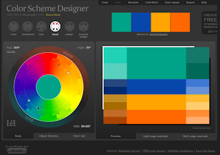
When we had to make our ancillary products, chosing the right picture was crucial. With a picture comes colour, and it may be sometimes difficult to pick the right colours for the elements that will feature on top of the photograph (Text, ...). Colour Designer allowed me to see which colours would go with the light blue of the sea shell.

In order to create my ancillary work, I had to carefully chose a font that would suit with the image of the artist I wanted to communicate. This website has allowed me to browse through thousands of fonts and to pick the right one, after narrowing my selection to a few.

When it was to the actual making of my ancillary products, I've used Photoshop. I was already familiar with this program as I've used it many times in the past. There are so many tools that this program features that have proven to be useful during this stage, but I think that the main one is the layers. The fact that this program layers everything you do (Text, images, shapes...) is really handy. I've also used its colour correction feature in order to enhance the colours of the photographs I've used.

As you are aware, my advertisement features a QR code. I've made this using this website, which features a QR code generator. You can specify the link where the code will take you and it automatically generates an image. Very useful!

Another generator I've used, is a gid generator. This is how I've created all the gifs that I've embedded on this blog. Once all the stills are ready (screenshots of a video, every second) you sent them to this website using the form and it automatically generates an animated gif for you.
Finally, Blogger played an important role in this task. Blogger is a powerful blogging editor which allows you to post whatever you want (text, videos, gifs, images, embedded html code...). This was used to share, with you, my progress throughout this task.
Thursday, 26 January 2012
EVALUATION - Question 4
What have you learned from your audience feedback?

On the 6th December, the media department has invited all media students to come along and watch everyone's production on the big screen at The Screen on the Green in Angel. It was a great opportunity for us to see how our the audience reacts to our video, to get individual feedbacks but also an incredible chance for us to watch what we've been working on on the big screen.
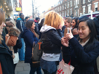
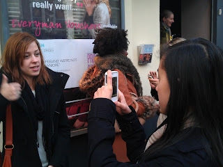
After the show, we've managed to film our audience reaction to our video and got some feedback from them. This was very interesting for us to see how our audience reacted to our video, if they liked it and to know what was good or what they think went wrong.
Below you will find five feedback videos which I'm going to talk about in more details afterwards...
The feedback we've had from everybody was very positive, which I think reflected the amount of planning and preparation we have done throughout this task. They've all stated that the location was one of our strengths, which has made our video look unique amongst the others. We were really glad to hear that, filming in Brighton was fun but was above all a lot of preparation. Nick then stated that the editing was on-time, which made it a genuine music video. This is really important that the editing follows the pace of the music, we have spent weeks to make sure that all our shots and the cuts were on beat. The text we've added and the choice of our performer was also something they've appreciated.
I think I may say that we've met our audience's expectations. We have made a great video and the fact that we've filmed it in Brighton contributed a lot to the success of it. At first, we were looking around London and on Google Maps to look for locations that'd match the lyrics of the song but we weren't completely satisfied with what we've found. We were then wondering if it'd be possible to film at the sea side. We have been warned by our media teachers that we should be carefull with this as it requires a lot of planning, which we weren't worried about because I think that as a group, our strengths was our planning skills and our reliability.

I think that the filming is something we can improve on. Despite having really good shots, a few of them look "experimental" to me and are very shaky. Since we didn't have a rail to put the camera on, it was very difficult to obtain a stable image while moving back...


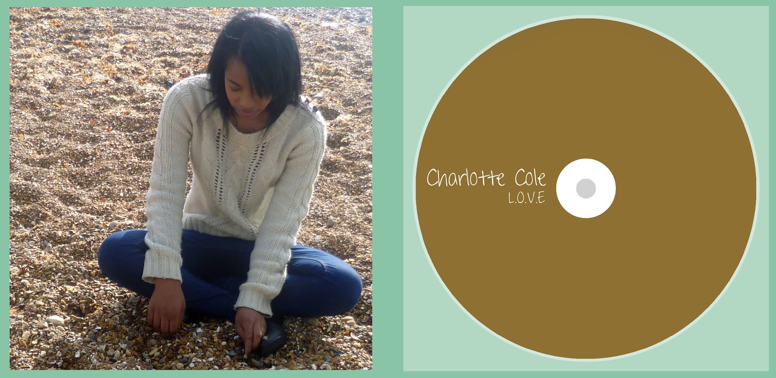
The outer panels of your digipak are great. I love that you used one photo that spans across both panels. Overall it's simple but very effective. The only improvement I'd suggest is maybe have the album title stand out a bit more, although I understand that the focus is on th artist's name which is very eye catching. The inside panels are again simple, but maybe a bit too simple. It feels like it's missing something - possibly a less minimalistic CD design? Other than that, great!
I love your advert. It's pretty much perfect. The only thing that bugs me is that I feel like the text should have been placed a bit more to the left (and resized slightly if necessary), but other than that - awesome! The QR code is a nifty idea, and your use of asterisks instead of more conventional stars for the album reviews is cool and quirky.
Overall, your products link very well, and I must commend your choice of photo. Now where can I buy this album?
This is one of the many feedback I've had for my ancillary products. I've chosen to publish Nick's because I think it is the most elaborate one and covers what the other people have said.
Overall, my ancillary products work well together and the clear visual link with the video have made it successful. However, there are a few areas that can be improved. As suggested by Nick, the placement of the text in my advert is a bit too much on the right. This is something I haven't immediately picked up but that is now annoying me. A smaller size for "Out 1st February" and a different placement would have been beneficial, as I think it shouldn't reach the hole of the shell. But appart from that, I'm glad that the audience has appreciated the QR code idea.
Regarding the outer panels of my digipak, I'm glad that the picture met the audience's expectations as it was really difficult for me to choose one as they were all really good! However, there's something that I've noticed after submitting my work, and that Nick picked up, is that the title of the album doesn't stand out very much. I think a different colour would have worked better but at the same time I didn't want to use white as I thought it'd be overused.
Tuesday, 24 January 2012
EVALUATION - Question 2


These are album covers from similar artists. They all convey the same message; the one of a serious, glamourous but individual song writter. This has inspired us to promote those different aspects in our video but also in our ancillary work.


We can clearly see that serious song writters (VV Brown, Adele...) use simple shots in their video to emphasis their personality. Cher lloyd's, however, is heavily edited which suggests that this is more mainstream.
Charlotte Cole is a new artist and a serious song writter. Therefore, we have decided to keep our shots simple and to stay away from heavy editing.

In conclusion, I think that the combination of our main product and my ancillary works work very well together.
Monday, 23 January 2012
EVALUATION - Question 1
In what ways does your media product use,
develop or challenge forms and conventions of real media products?
In our pitch, which is available here, we've outlined our wish to follow Andrew Goodwins' theory on the structure of music videos. Our video rely mostly on repetition of shots, such as at the carousel or in the boat, or at the beach.


We also have some form of ending; our performer makes a direct eye contact with the audience.
 |
| Beyonce, at the end of her Countdown video. |
 |
| Charlotte Cole, at the end of her video. |
Our video has little connection with the lyric, therefore I think we can say that the relation between the song and our video can be described as disjuncture. In addition, it may also be described as amplification as some of the words of the lyric are amplified by the use of obvious editing.
This video shows the use of obvious editing. For this convention, we have chosen to use text as it allows us to amplify the lyric. We have based our idea from two videos: Kanye West - Good Life and Cher Lloyd - Swagger Jagger. We have chosen to amplify some of the lyric in our video in order to add more value to them.
This video shows the use of disjuncture. We have chosen to use a carousel as a filming location for this, as we thought it'd be different. We have based our idea on the video of SALM - Rondoparisiano.
The main theme for our video was to show a young, urban girl clearing her mind at the sea side in order to forget what she's currently going through. The lyrics of the song doesn't reflect that, we have therefore decided to use disjuncture in order to show this more clearly to our audience.
The main theme for our video was to show a young, urban girl clearing her mind at the sea side in order to forget what she's currently going through. The lyrics of the song doesn't reflect that, we have therefore decided to use disjuncture in order to show this more clearly to our audience.
This video shows illustrate how artists makes direct eye contact with the camera. We have decided to follow this convention as it is crucial in a music video. Our artist is new, unknown from the public, therefore she needs to introduce herself and by looking straight to the camera, she is introducing herself to her audience and shows how serious she is.


As I explained in this post, Lights' album "The Listening" have influenced the style of my digipak. The way her album is simplistic and clear. I wanted to keep that convention.


We have chosen to incorporate a QR code to our advert to encourage our audience to discover our artist via their smartphone. This is used by VEVO on YouTube to advertise mobile versions of their service.
Monday, 9 January 2012


Audience feedback of Ancillary work
Before submitting my work, I've asked a few people what they thought about my work...
- Danielle
Front and back cover - The colours work together. The artist's name stands out. Clear image of her, we can already tell something about her. The font is simple, and consistant.
Inside panels - Simple. The picture works well, the colour of the CD is really good.
Ad - Clear link with the album cover. The name is clear, and bold. The reviews stands out.
- Sharmin
Front and back cover - Good choice of image. The font is really nice and clear, yet it looks like a handwriting . It is consistant.
Inside panels - Consistant, simple.
Ad - Clear link with the album. Simply elegant!
- Konrad
Front and back cover - Good. Clear link with the music video. Motif.
Inside panels - Simplistic. The picture gives the impression that the artist is sharing a personal side of her life. It engages with the audience.
Ad - Clear link with the album. Good use of the QR code.
- Natalie - Very good, however I think the QR code would look better on it's own. No text above it. Also, the QR Code should be transparent.
I have used Natalie's feedback and made the QR Code transparent. I have checked, with my phone, to make sure if it still works. The QR Code takes us to our blog!
 |
| Finished advert |
Production - QR Code
As specified in my advertisement mock-up, I wanted to place a QR code. This QR code is, I think, appealing to young people and provides an easy and fast way to access contents from their smartphones.
To make the code, I have used a QR-Code generator....

I have saved the image that has been generated and imported it to Photoshop.

To make the code, I have used a QR-Code generator....

I have saved the image that has been generated and imported it to Photoshop.

Production - Starting the advert...
I've left the advertisement until the end, as I think that once you've done the digipak it is a lot easier to do the advertisement since it has to reflect the design, colour code of the digipak.


 |
| I've changed the background, in order to make a direct link to the front cover of my digipak. |

 |
 |
| I've added the Facebook and Twitter logo. |
 |
| I have decided to add reviews, instead of tour dates, as this is a new artist. |
Subscribe to:
Posts (Atom)