
Strengths
- Good layout, colours
- Good graphic
- Good font choice
- The third person is slightly out of focus
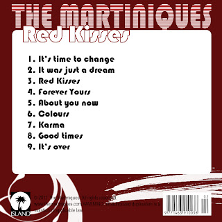
- Spelling mistake on the back cover ("duplioation")

Strengths
- Very good choice of colours
- The photographs look professional
- Very good graphics
Weaknesses
- The font used for the artist name is a bit hard to read (Is it Indiya, or Indiva?)
- Thank yous - Looks out of place
- Writing accross her face (on the CD, and on the back cover)
- Wrong "Sony Music" record logo

Strengths
- The colour of his hoodie is used throughout the whole digipak
- Good graphics
- Good photograph of him
- The extra panel, although containing a bit more information, it mainly repeats what we already have on the back cover; the tracklist.
- Two record label companies - Sony Music and EMI.
- iTunes and HMV logos at the back cover.