This years media coursework has finally come to an end ! i've enjoyed most aspects and the highlight would definitely have to the day spent filming with my lovely group !
i've been haunted by you for the past two years and now it's finally time to say farewell woohhooooooo!!
Showing posts with label Danielle Hay. Show all posts
Showing posts with label Danielle Hay. Show all posts
Friday, 27 January 2012
Thursday, 26 January 2012
Evaluation Q4: What have you learned from audience feedback ?
our music video got played at a cinema screening of the whole of A2 . The general reception from the audience was great ! a clip of the audience reacion made at the end of our video premier !
Some of the feed back from my completed ancillary work was also given comments below ;

From the feed back i have received on the music video and ancillary products was overall positive but comments of slight improvements were given about the music video specifically camera work when hand held use of the camera was used was an improvement this could have been avoided or improved by the use of tripod but the down side would have meant that there would be a lack of varied shots types .
All comments which were made are very important as they were either constructive criticisms or very complimentary. The comments were very useful as i was able to see potential improvements that i myself hadn’t recognised. From the feedback I am able to assume that my work was for the majority successful if the products were to be created again taking into account both the positive comments and criticisms the product wouldn’t differ much from the high standard produced .

Wednesday, 25 January 2012
Q3 Evaluation : How did you use media technologies in the construction and research, planning and evaluation stages ?
Media technology was a tool that was used in all parts of the process of this piece of course work from the very beginning.
Below is an animatic created before our actual music video using a normal digital camera photo's were taken then imported into final cut pro, which was used in combination with another useful technology mac computers .
The internet enabled me to use even more media technologies such as :
Blogger which was vital in the planning process as it allowed me keep track of what was being completed planning if it were done manually it would have without a doubt have been lost but blogger kept an archive of work which is useful as i am able to go going back back all the way to the start of the course .
I used the program volia to create the clips of how i used these media technologies
Mpeg stream was what was used to convert the format of videos such as our animatic and our music video to enable it to be uploaded to the blog and vimeo
Photoshop was used to create my ancillary products being able to distort images and develop from my original mock up on paper to a digital format.
Youtube was used to help all stages research, planning and evaluation it was used as a tool to find the song used in the music video then it was tool to help research different music videos and allowed us to recognise the conventions which we are included in my music video. You tube also helped me to use another technology photoshop by watching online tutorials .
Final cut pro was one of the vital technology's used for the editing process which was a development from previous use as this time the use included using markers and keeping tracks in sync .Video Camera's were another technology of great use as it was what was used to film the music video, the cameras worked along side another technology used memory cards which enabled us to film a large amount of footage as they store a large volume of data.
Thursday, 19 January 2012
Monday, 16 January 2012


Tuesday, 10 January 2012
Production of Ancillary Work
Before my ancillary work encountered some technical difficulties i managed to get some feed back on my advertisement and digipak from some peers as follows ...
- Most thought that the colour change was effective as it made the image of the artist stand out as well as the font which was noted to be bold , clear and simplistic
- The artists initials on the cd was said to be interesting along with the capitalisation of the CC on the outer panel and advertisement as it emphasised who the artist was
- On the outer panel the heart which i used to cover another image ( Talked about in previous post ) was said to work well with the colours
- the colour of the track listing being the only blue font in my ancillary work was said to be a good thing as it stood out and was one of the first things that caught their attention
- Something which was pointed out which i hadnt noticed was that one of the track listings was a larger font then the rest which i intend to correct
Production of Ancillary Work
Just as I had managed to complete my ancillary work I encountered some technical difficulties with my usb and i thought I'd lost all my work :( but thankfully the media technicians have been very helpful and managed to save some of my work . So i've gone a couple steps backward with my ancillary work which I'll be trying to get completed as soon as possible
Monday, 9 January 2012
Production of Ancillary Work
i've been making some final changes to my digipak and the mainfeature that has been changed after feedback from rebecca is the colour . It's changed from blue to green !
The change was after feed back that the image which my the track listing is on looked a little strange and i decided to use photoshop to distorte one of our image taken on location and place it over which worked well but then it seemed that the back ground colour blue contrasted the image a little so it made sense to change it to green which i feel works well with all the images
 |
| Before |

 |
| After |
Sunday, 18 December 2011
I've started to work on my digipak something which at first I was still finding a little difficult as I'm still not used to using Photoshop and some of my initial ideas that i had put in my mock up don't look as impressive in reality. so far I've stuck to my colour scheme of blue , white and black and below are a few screen shots of my digipak !


Monday, 12 December 2011
PLANNING: Additional Photos
On todays lesson we started to do our digipak in Adobe Photoshop Elements however we realised that we don't have enough images of the artist, close ups and mid-shots in particular. We have decided to take some more pictures in the room with the green screen so it's easier to edit. The lighting in that room is also much better. We will take the pictures during lunchtime and then add them to this post.
Below, are a few pictures that Max took during the "photo shoot"...


Saturday, 10 December 2011
Mock up of Digipak and Advertisement
I pitched this idea to my media teacher (Tony) and the rest of the class .I decided to to my mock up of my digipak and advertisement the old fashioned way ! above are some images of a rough idea of what my end products may look like .
Colour scheme and fonts
I found a program on on the mac's that had a wide range of fonts some of which i thought would work well for my digipak and advertisement
Potential Fonts :


 Another font that i have been thinking about using Gill Sans Light the font used for TFL
and the font used our music video
Potential Fonts :


 Another font that i have been thinking about using Gill Sans Light the font used for TFL
and the font used our music video
Potential photo's for digpak and advertisement
i have decided to make a four panel digipak and these are some of the potential images i intend to use for my digipak as well as my advertisement.my main reasons for selecting these images are that i think they would represent the artist (Charlotte Cole) in a positive manner .
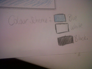
I have also come up with a potential colour scheme for my advertisment and digipak which is a mixture of three colours Blue white and black
Examining Previous Ancillary Work
As a class we looked at and examined previous student's work which included digipaks and advertisement and these were some of my findings !
The Martiniques :


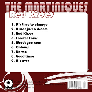
I found that some of the strengths of the ancillary work were things such as : A constant use of the same font , The artists name is in the largest size font , The advert has the record label logo , the main image has all band members making direct eye contact to the audience . The colours used are eye catching and it is easy to see the colour scheme. A weakness of the ancillary work is that there appears to be a spelling mistake
Stephnie Jackson :

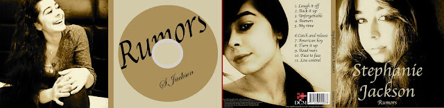
Some strengths of this ancillary work is that the images used look a high standard , the sepia colour of the images is used constantly throughout . however some weaknesses were that the title of the album was spelt wrong . in the digipak it appears that the images are of three different people which is confusing as it's not quite clear who Stephanie Jackson is .
Y.Shocker
: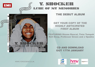
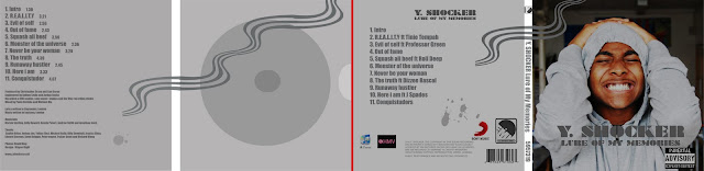
Some Strengths : The constant colour theme , the graphic "wave" is eye catching Weaknesses : The digipak has two conglomerate logos stating that the artist is signed to both which is very unconventional . Also having the hmv and iTunes logo on the digipak is something that is never included . Something that i disagreed with one of my teachers on is the back ground of the image of the artist, it's not clear where the artist's location and it looks as if he is standing in a corridor which i thought went with the genre ( I assumed it was grime ) as it gave a very "urban " and street feel .
The Martiniques :
I found that some of the strengths of the ancillary work were things such as : A constant use of the same font , The artists name is in the largest size font , The advert has the record label logo , the main image has all band members making direct eye contact to the audience . The colours used are eye catching and it is easy to see the colour scheme. A weakness of the ancillary work is that there appears to be a spelling mistake
Stephnie Jackson :
Some strengths of this ancillary work is that the images used look a high standard , the sepia colour of the images is used constantly throughout . however some weaknesses were that the title of the album was spelt wrong . in the digipak it appears that the images are of three different people which is confusing as it's not quite clear who Stephanie Jackson is .
Y.Shocker
:
Some Strengths : The constant colour theme , the graphic "wave" is eye catching Weaknesses : The digipak has two conglomerate logos stating that the artist is signed to both which is very unconventional . Also having the hmv and iTunes logo on the digipak is something that is never included . Something that i disagreed with one of my teachers on is the back ground of the image of the artist, it's not clear where the artist's location and it looks as if he is standing in a corridor which i thought went with the genre ( I assumed it was grime ) as it gave a very "urban " and street feel .
The Do's And Don'ts of Design Work
After our analysis of digipaks and doing some research on the conventions of ancillary products a few do's and don't were explained .
Dont's :
Do not use images print screened from music videos as they will appear pixelated
Do not stretch images
Only use effects is they suit the genre
Have a valid reason for using font not just because you like it
Do's :
Use Clear font
Use a layout that follows the rules of thirds of composition
Use appropriate industry logos e.g : Record company logo's
Use clear photo's that are in focus
And most importantly BE CREATIVE !!!!!
Thursday, 8 December 2011
we were given the task of having ago at creating out own cd covers .. i'm not the most confident person when it comes to using photoshop so i was abit apprehensive but our teacher gave us a mini tutorial in using photoshop to create and a new program we were introduced to called quark express .


The finished product ! :


The finished product ! :

Saturday, 3 December 2011
Wednesday, 30 November 2011


Subscribe to:
Posts (Atom)