I found a website; colorschemedesigner.com, which finds colours for you. So depending which colour you pick and whether you want the other colours to be mono, complement, triad, tetrad, analogic or accented analogically, the other colours will be chosen for you. Here are some examples of what I found:


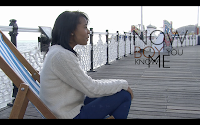
From the beginning I knew what font I wanted to use. Its Gill Sans, a font used in our video and apparently also used by London Transport. I think using the same font as in the video links the album with the video nicely because its a subtle link. This font could also become a way of recognising the artist later on because it's quite simple and looks good in any occasion. I dont want to use font colours that are too drastically different from the colour scheme so I will probably hold on to black or white depending on the final design.

