Showing posts with label Konrad Maselko. Show all posts
Showing posts with label Konrad Maselko. Show all posts
Sunday, 29 January 2012
FIN
This is the end. No more blogs about our inspiring research, creative and detailed planning and exhausting and long production :) This has been a fantastic journey and I really enjoyed all the time I spent filming, editing and blogging after hours. It would not be possible without my fantastic group members(Max, Natalie and Danielle) as well as my extraordinary teachers; Tony and Rebecca :) I hope my blog will be a joy to read. Goodbye

Thursday, 26 January 2012
EVALUATION: QuestionFour - What have you learned from your audience feedback?
The reaction of the target audience is the most important thing in making a product. It's them that we make it for so they have to be satisfied.
Right after I've finished my ancillary products I have asked some of my class mates to review my design. The reactions are written and linked here on a post that I wrote earlier.
To get a point of view of a wider audience I asked some of my friends to review my ancillary products through a social networking site; Facebook:

 I have also created a survey and posted it on the blog to get general opinion on my products. Here is the animation showing the results:
 On the day of the cinema screening I have recorded the reactions of some students and a media teacher; Mary. Here is the video showing their reactions:
Right after I've finished my ancillary products I have asked some of my class mates to review my design. The reactions are written and linked here on a post that I wrote earlier.
To get a point of view of a wider audience I asked some of my friends to review my ancillary products through a social networking site; Facebook:


I was pleased with the reaction that our video got during the cinema screening. I could hear that everyone enjoyed the video. Whether it was the location, singer or the lyrics on the screen; people were enjoying the screening.
I have done all this to get a clear idea of how my product was seen from the point of view of my customers.
Our music video theme and the reason why it appeals to the target audience is not random. We have made a profile for our target audience in our pitch. Here is the screen shot from our prezi:
 I think that my music video and the ancillary products work well with the target audience that we considered in our pitch. This is also why our reviews are very positive and appealing to the audience.
There weren't many negative comments about my design but I will go over some things that I would change.
I have done all this to get a clear idea of how my product was seen from the point of view of my customers.
Our music video theme and the reason why it appeals to the target audience is not random. We have made a profile for our target audience in our pitch. Here is the screen shot from our prezi:

There weren't many negative comments about my design but I will go over some things that I would change.
Font
Many people like the consistency of using just one font; Gill Sans Light. I also only used two colours and two "shadows of red and blue". This made the album look professional.
However I got a few comments that the track list has a colour that is difficult to read because it blends in. I used white font on a light brown background which could explain the blending in. I have also received a comment that the font uses inconsistent capitalisation which I agree with. The track list uses capital letters only for the beginning of the track name and not for every letter or even every word.
I have used capital letters all through out the digipak except for the track list which might look odd.
Advertisement
I got a suggestion that the CD cover or the background in my advertisement should use more intense colours to stand out more. I think this is a valid advice but it won't really add anything better to my design. I have used a colour that is quickly associated with the album and i think it works great. I have used a shadow and my QR code is on top of the album which creates layers. I think this makes the digipak stand out on the similar background of my ad.
Front Picture
"I think the photo on the front would have looked better if there was a bit less opacity"
This is one think that I did actually try out before finishing my digipak. I have used lower opacity to check how the image looks and whether it makes the image blend in nicely. As I did so, the image became less and less recognisable because it was blending in with the background too much. Because the patterns and colour are similar on the image and the background the blend in nicely the way they are know.
Inside
I got mixed reviews of the design. Some say that it's too empty, some that it is simple and it works. I have decided to use just a few images and no text. Also the CD only has the artists name ,the album title and the "Brighton doughnut" outlines. I think this simplistic approach makes the CD more professional and appealing to my audience.
Audience Feedback Questionnaire
Create your free online surveys with SurveyMonkey, the world's leading questionnaire tool.
EVALUATION: QuestionThree - How did you use media technologies in the construction and research, planning and evaluation stages?
Over the past months I have used a variety of tools and technologies to create my final products in the best quality. I have also used many technologies to broadcast and share my ideas, research and production.
Programs:

Final Cut Pro
Production:
Final Cut Pro was one of the most important tools that I have used. It let me edit, manipulate and put in place videos taken at the sea side to create the music video that everyone enjoyed so much.
I have used this program last year which made it this much easier and quicker to use this year.
I could easily cut and put separate videos in the right place. I was able to mark the video with the beat using "markers" (using the M key) which really helped with precise editing of the music video. I also used the markers to put all the base track and videos in synch with the original song.
Research:
In our final version of the video we didn't include any special effects done on this software but here is a video of me trying out some potential effects:
I have used this program last year which made it this much easier and quicker to use this year.
I could easily cut and put separate videos in the right place. I was able to mark the video with the beat using "markers" (using the M key) which really helped with precise editing of the music video. I also used the markers to put all the base track and videos in synch with the original song.
Research:
In our final version of the video we didn't include any special effects done on this software but here is a video of me trying out some potential effects:
I was trying out a few effects(such us slow-motion and overlapping) that we could have used in our video to see whether they would fit into our genre and video. At the end we decided to only use lyrics on the screen. Using too many effects makes the video look unprofessional it also doesn't fit our genre.

Adobe After Effects CS5
Production:
I have used Adobe After Effects to create the lyrics on the screen. I used this software last year to create Candi Studios logo/animation so I knew some basics.
I prefer Adobe After Effects more than LifeType because it has much more possibilities and it is easier to time the lyrics more precisely.

Adobe Photoshop CS5
Production:
I have used this software for a few years now which allowed me to make my ancillary products much easier and faster. I have started by choosing my colour for the background and I used an Artistic Filter which created a nice paper pattern. Here I show how I apply a sponge effect on a different(to the colour I used in my design) coloured paper:
However real life images and textures can never look better when made digitally therefore I scanned pieces of watercolour paper painted brown and used them instead in one of the final stages of my production. At the end I have applied this effect only to my photos to blend in better with the background.
 A "grid" is a great thing to align, put desired images in the right place and in a good distance from each other. It is a simple tool that can make a big difference to the final product. It really helped with aligning the text, logos and images inside the digipak and on the advertisement.
To create the vintage, newspaper or as some called it the "3D" effect I simply duplicated the images and layered them on top of each other. I slightly shifted each of them to one direction and disabled one of their RGB colours to reveal either red or blue colour. Changing their opacity made them less strong and more like shadows; something additional and not the main focus.


iShowU and QuickTime Player
I have used iShowU and QuickTime Player to record the screen and show whatever program I was using and how I used them. It allowed me to easily express and explain how and why I did some effects.

MPEG Streamclip and QuickTime Player
 I used this software to export my videos in a lower quality that allowed me to post them on my blog. I used them to export my screen recordings as well as the interviews and the final edit of our video. The screen shot on the left shows MPEG Streamclip. To export them I had to drag my video clip to the center and select a preset that was compatible with blogger to get the best quality video which I was able to post.
Internet
Hardware
State of the art video cameras, memory cards, cameras, hard drives.
Blogger, Facebook, YouTube, Picasion, PhotoBucket
Hardware
State of the art video cameras, memory cards, cameras, hard drives.
All of this allowed us to film, plan and take potential pictures for the digipak. We have used the cameras to make an animatic which really helped with filming because we knew what and where to film and when to put it in the video. It shortened our editing and filming time which is one of the reason why the music video was a success. Here is the animatic that we made few months ago:
The video cameras allowed us to film the music video in a really hight quality and memory cards allowed us to instantaneously move that footage to our hard drives and edit.
Tuesday, 24 January 2012
Audience Feedback - Ancillary Products
Here are some responses from my classmates and my teacher Tony about my album and advertisement design:
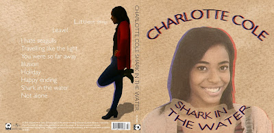


Front Cover
Good:- Background (colour and texture)
- Image Effects
- Red and blue shadows
- Worn out look
Bad:
- Image blends in with the background
- Inconsistent capitalisation with the title and the track list

Inside
Good:- Clear link
- Simple and professional
- Colour scheme
- The CD "doughnut lines" look like whiskers
Bad:
- Empty/lack of text

Advertisement
Good:- Clear Link
- CD stands out
- Good reviews
- Great idea with the QR code (maybe get rid of the white inside the code)
- Simple
I'm very happy with the result. After I got the feedback I have changed one thing which is using capital letters for the track list to let the album design flow better. Previously I have used small letters throughout the track list and capital letters everywhere else.
I didn't want to get rid of the white background of the QR code because I think it would decrease reliability of that code when it's printed on a low quality newspaper.
Monday, 23 January 2012
EVALUATION: QuestionTwo - How effective is the combination of your main product and ancillary texts?
I think that both my music video and my ancillary texts are successful and work well together. There is a clear link between those two products as well as the songs on the track list which follow a similar theme. My music video was influenced by many artists and a plethora of music videos which I discussed in more details in question one of the evaluation. However my album cover was influenced mainly by Kate Nash's album "My Best Friend Is You"(except the CD design which was influenced by Clare Maguire's "Light After Dark").
The purpose of a music video and an album cover is to advertise and represent the artist therefore both of my products should be linked to easily associate one with the other.
The purpose of a music video and an album cover is to advertise and represent the artist therefore both of my products should be linked to easily associate one with the other.
Monday, 16 January 2012
EVALUATION: QuestionOne - In what ways does your media product use, develop or challenge forms and conventions of real media products?
As we explained on our pitch, our video is an example of disjuncture and illustration which are two of the three of visualisation types of music videos according to one of Andrew Goodwin's theories. The music video doesn't have a specific story it's random and abstract which are the qualities of disjuncture. However it shows the seaside and is easily associated with the direct meaning of the lyrics. It also illustrates the lyrics using text.
We used a few base tracks to which we came back every now and then to give the video a structure. We followed Carol Vernalis's theory by using lots of jump cuts and a special effect (lyrics on the screen) in the rhythm of the song. These are some of the codes and conventions that are used in most of music videos. Examples of some of the videos can be found in my previous posts. All of those codes and conventions help the video to stand out and appeal to the audience which is why they are used so widely.
Here are some of the more memorable influences in our video:
Starting with the lyrics on the screen which was the main motif going through out the video. I was inspired by the Wretch 32 video which includes drawings on a wall however that would be too time consuming to achieve good results. After watching Cher Lloyd and Kanye West I decided to add lyrics digitally. I think this effect
I had the idea of a carousel ever since we decided to go to Brighton. Then I found Leona Lewis's video which had a carousel in it and so I decided that we definitely want to use one in our video.
The ending, even though short and not as noticeable was inspired by Beyonce in her video Countdown. I think it creates a connection between the artist and the audience making the video seem more personal.

Artist's official video of the song was also one of my main influences. The general colour scheme gave it an indie vibe which I used in both the album cover as well as the music video. Our artist was wearing an off white/brownish jumper and jeans which I think worked with the genre and represented the artist well. The overall colours of the video are pastel and therefore are easy on the eye and work well with the artist and the genre.
There are many other influences for our music video such as music videos by Florence and the Machine, Lady Gaga, Shakira, VV Brown, The Verve and many more artists. This shows how our video is connected to many other music videos and artists. It uses codes and conventions that are used by many other producers simply because they are targeting the audience well and make the videos more entertaining therefore advertising the artists.
Ancillary Products

This is a screenshot showing part of my digipak with the required information that all albums have. It has a barcode, logo of the company on both the back and the spine, information about the copyright and the serial number of the album at the back and the spine. These are few of the main codes and conventions of an album cover.The album must include artists name, title of the album and a track list.
They should but are not limited to include/use; up to 3 or 4 colours, maximum of 2 fonts, image of the artist. Some artists are more abstract and independent and don't follow these codes because they treat the album as an artistic piece however they are a small percentage of the album artwork.

This is the front of my album cover. Because it's an album for new and upcoming artist, I'm closely following the codes and convention. I made the artist's name big and easy to read, it's bigger that the album name which is one of the conventions. The album artist has a big picture, facing and looking at the camera. This advertises her well because the audience can now easily remember her face and recognise her more easily later on.The picture also takes up roughly 2/3 of the front panel which is an other convention.

The album cover and the advertisement should also have a clear link and I think I've achieved that in my design.

We haven't been given any codes and conventions about the design of the CD but generally I think that the CD should mirror the album cover to know where the CD belongs. I have also looked at some CD design from other artists in a similar genre as Charlotte Cole's Shark In The Water and I've noticed that the album name is a must on the CD. They also often include artist's name, a track list and use the same colour scheme.

I have based my design mainly on Katy Nash "My Best Friend Is You" which I think is unique and stands out from the others. I didn't copy the digipak completely. I have used ideas from the cd cover, inside as well as the booklet. I really liked the worn out, vintage look which I tried to recreate.

My CD design is completely different to Kate Nash's. This is because I did some research and I used Clare Maguire "Light After Dark" CD design as my inspiration. It's simple and professional.
Thursday, 12 January 2012
PRODUCTION: Final Digipak and Advertisement
Here is the final design of my album cover and the advertisement:


Monday, 9 January 2012
PRODUCTION: Inside Panel - CD


The artists name and the album name looks blurred but it simply has red and blue overlay.
PRODUCTION: Advertisement

I included the album cover, artists name, ratings date released and placed where it can be bought from. The background is the same as the background of the album and so is the font.
I'm also considering adding a QR code, website address and facebook page. All of these will make it more appealing for younger audience.
Sunday, 8 January 2012
PLANNING: Font


PLANNING: Colour Scheme and Inspiration
Kate Nash's "My Best Friend Is You" album is my inspiration for the digipak but so is Andy Smith's "3 Colour Monster" because of the unique use of colours.

This way my piece would stand out on the shelf and still keep a simplistic look with a colour scheme good for the genre. I will use the brown/orange like before but also some blue and red to make the digipak stand our more. Here is a preview of the album in Photoshop:

Wednesday, 21 December 2011
PRODUCTION: Background
After experimenting with the effects on Photoshop and Photoshop Elements, I wasn't satisfied. I've decided to make my own backgrounds, scan them in and use them in my design. I bought some watercolour paper because it's thick and it's easier to create different shades and effects on it. I used a transparent, brown ink and scanned the papers. Here is a slide show of the scans(four scans of seven pieces of paper including blank papers to manipulate on Photoshop):
Monday, 12 December 2011
PRODUCTION: First day of production
Today I started creating my digipak design on Photoshop Elements. I was experimenting with different textures and effects. I also had a go at creating the effect of ripped paper. Here is what I came up with for the front and back cover: There are still some part missing such as artist info and copyright and spine information. I might also reconsider some of the effects that I have used.


PLANNING: Additional Photos
On todays lesson we started to do our digipak in Adobe Photoshop Elements however we realised that we don't have enough images of the artist, close ups and mid-shots in particular. We have decided to take some more pictures in the room with the green screen so it's easier to edit. The lighting in that room is also much better. We will take the pictures during lunchtime and then add them to this post.
Below, are a few pictures that Max took during the "photo shoot"...


Sunday, 11 December 2011
PLANNING: Inspiration
My first design was not inspired by anything which is probably why I rejected it quickly.

My second design is inspired by Kate Nash and her album "My Best Friend Is You".
I like the off white colour and photomontage used. I would like to create an old, used, worn out look which I think is good for the genre of the artist. I'm also considering using some song titles from her album that would match my album such as "I Hate Seagulls"
PLANNING: Mock up of my advertisement

PLANNING: Mock up of my digipak
The above is a slideshow of my ideas for a digipak and the advertisement.


Finally I will use the image of "Brighton Doughnut" because its unique and works well as a CD design.
RESEARCH: Previous student work - Advertisement
Here are three advertisement made by previous students. I will analyse them by pointing out what I think are their strengths and weaknesses.
 I really like this image, its very powerful and introduces the artist very well. I like the colour scheme; this sepia, old look works well with the genre. The image used links to the album and therefore does it's job of advertising it. The font is big and easy to read but the name of the artist should be bigger. I personally wouldn't use two different font but I think it looks ok with this advert. Album rankings/reviews or tour dates would improve the look of the advertisement. Without it, it seems like there is something missing.
 This is another advertisement that I like. It's simplistic but not simple. It shows off the album design very well, it's clear that this is an album poster because of the ratings, "OUT NOW" and places where you can buy it from. However I wouldn't use OUT NOW in my advertisement because I think it's important to advertise a product before the release and not after.
I don't like how there is a white background in the logos of iTunes, HMV and Amazon which unfortunately is where the eye immediately goes.
Subscribe to:
Posts (Atom)